I’ve been using grid systems in some way shape or form for the past 3 years. From 960.gs, the 1kb grid and 1140, to fully-fledged frameworks like Bootstrap and inuit.css.
They were (are) excellent tools for quickly knocking together sturdy layouts. However each project is different, and — especially with responsive builds — each layout comes with its own nuances.
I’m not keen on using front end frameworks as a one-stop solution, preferring to pull together certain libraries to do one thing and do it well. This is what led me to create the layout system that we currently use as the basis for our bigger projects at Studio-40: MatryoSass (Matryo for short).
After some thought, the needs for our grid system boiled down to:
- Sass based
- Responsive, with IE8 support
- (Infinitely) Nestable
- Fractional, none of this span-12 malarkey
- 5 base widths for media queries
- Easily customisable per project
Semantic vs presentational
The first major decision to be made was whether it was to be semantic or presentational. In short, semantic means that additional <div>s are not used to form layout, the grid styles are applied directly to (semantic) HTML elements or classes, leading to less markup and no presentational grid-col-esque class names. Presentational is the opposite; layouts are formed by a collection of grid and column classes which act as an additional layer around the content and/or semantic elements (nav, aside, article).
I decided on presentational. I’m a firm believer in separation of concerns, and keeping the layout away from the content made a lot of sense. I also find being able to glance at the markup and get a very real idea of what should be happening on the screen incredibly useful. Almost invaluable.
Take the following examples, although the semantic version may look cleaner, I have no idea what the expected layout should be.
<!-- Semantic -->
<!-- No idea on layout, could be block, inline, a mixture of both -->
<nav>
    <menu>
        <li><a href="/">Home</a>
    </menu>
</nav>
<article>
    <h1>Title</h1>
    <p>...</p>
</article>
<aside>
    ...
</aside>
<!-- Presentational -->
<!-- A quick glance and we know it's a 3-column layout,
in the form of [25%][ 50% ][25%] -->
<div class="grid">
    <div class="grid__col 1/4">
        <nav>
            <menu>
                <li><a href="/">Home</a>
            </menu>
        </nav>
    </div>
    <div class="grid__col 1/2">
        <article>
            <h1>Title</h1>
            <p>...</p>
        </article>
    </div>
    <div class="grid__col 1/4">
        <aside>
            ...
        </aside>
    </div>
</div>
It’s not everyone’s cup of tea, but it works for us.
We’d previously been enforcing this rule when using inuit.css, and the “don’t add additional styles to the grid layout” is a simple and effective methodology to apply across projects.
A lot of the projects we do involve splitting up our HTML into partial files. If this is the case for you or your team, I strongly recommend the presentational grid approach. We have a loose rule that no grid styles are in the partial files. These partials are width agnostic components that can be included from within any column size. Here’s an example from a recent Symfony2 project, using Twig files:
<div class="grid">
    {# Footer Column #}
    <div class="grid__col 1/3 sm-1/2 xs-1">
        {% include 'S40ProjectBundle:Frontend/Footer:_nav-pages.html.twig' %}
    </div>

    {# Footer Column #}
    <div class="grid__col 1/3 sm-1/2 xs-1">
        {% include 'S40ProjectBundle:Frontend/Footer:_nav-support.html.twig' %}
    </div>

    {# Footer Column #}
    <div class="grid__col 1/3 sm-1/2 xs-1">
        {% include 'S40ProjectBundle:Frontend/Footer:_nav-legal.html.twig' %}
    </div>
</div>
This separation of components and grid layout partners really well with the concept and mindset of using partials.
Fractional
You’ve probably noticed that the grid class names we’re using are - quite literally - the fractional width we want. One of the major gripes I’ve had with other grid systems is this need to force 12-column layouts onto you whether you need it or not. Why write span-4 when you mean 1/3? Since when does col-9 mean 3/4?
Why should we be constrained by making everything have to add up to 12? It prevents you from using things like fifths, sevenths, eighths, and tenths (etc). What if you want a 3 column layout divided as 3/8ths, 4/8ths and 1/8th? Nope.
The answer was to use fractions as the class names. There was some consideration on my part on making them verbose written names, e.g. one-quarter, or even dashed like 1-4, but I was all aboard the fractional train and believed it would aid readability and keep class name collections to a sensible length.
Bit of a snag, the / character in CSS needs to be escaped. Thus our selector would end up looking like .3\/4 { width: 75%; }. It worked, but a better solution was to be had using attribute selectors: [class~='3/4'] { ... }. Same specificity, same result, more readable selector.
Notice the tilde in the attribute selector? It makes a big difference! It even helped out Harry Roberts on the newest inuitcss.
Responsive
A lot of the frameworks or grids we’d used previously came with 3 defined breakpoints, usually ‘phone’, ‘tablet’, and ‘desktop’ (or something of that ilk). We never found this to be enough, the gaps between them were too large and it didn’t offer enough flexibility.
Five seemed to be the magic number; loosely translating to ‘very small’, ‘small’, ‘medium’, ‘large’ and ‘extra large’. The specific widths themselves would differ from project to project — but we always ended up needing around five.
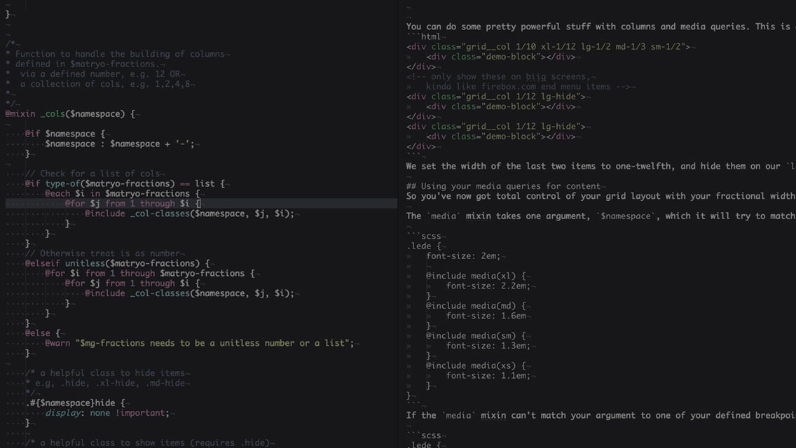
I opted for a top-down max-width approach, this is similar to what the team was used to and slotted nicely into our current workflow. The premise being you assign a base column width, and then adjust the width of that column with namespaced class modifiers that work down through the breakpoints. If we wanted a ⅕ width column which expanded to ⅓ on our medium view, it would look like <div class="grid__col 1/5 md-1/3">.
Customisable; Naming the things
Layouts are always different, and we don’t always need a full twelve or sixteen columns. One of the best things about Matryo is the option to pass it in a number of fractional widths you want created, e.g. $matryo-cols: 12, or a list of fractions you need, e.g. $matryo-cols: 1,2,4,6. This is a great way at the end of the project to get a nice file size reduction. By only using the columns you actually need you strip away all unnecessary classes.
As well as defining the columnal fractions we need, we also define the 5 widths that form the base of our responsive layouts, e.g. $matryo-bp-xs-width: 30em
We also give them a name.
If we want to call our smallest width ‘lil-sebastian’, there’s nothing stopping us: $matryo-bp-xs-name: 'lil-sebastian';
And now we get unbridled joy every time we target our smallest breakpoint:
// using the lil-sebastian named width media query in scss
.horse {
    height: $normal-horse;

    @include media(lil-sebastian) {
        height: $tiny-horse;
    }
}
<!-- using the lil-sebastian named width media query as a grid modifier class -->
<div class="grid">
    <div class="grid__col 1/4 lil-sebastian-1/2">
        ...
    </div>
</div>
Although 5 breakpoints seems to be the norm for us, it’s by no means the rule. That’s why Matryo breakpoints can be disabled if not needed. We may only want 3 breakpoints on a small project, so we disable the ones we don’t want. And — just like with the fractions list — we reduce the file size by not including classes for responsive breakpoints we’re not using.
Perf matters :)
If you’re wondering what all the double underscores are about in the class names, we use the BEM naming convention at Studio-40. That’s a whole different post in itself, but needless to say if BEM isn’t your thing the grid column class names are customisable too. Pretty much everything is.
You can check out the source code, demo and examples if you’re interested in a fully nestable, reversible, responsive, IE8+ layout system. And what’s next for Matryo? Well there’s plans to add in more named media queries, such as between two widths, as well as an option to choose between min and max-width media queries by default.